10 book covers that prove design counts

By Gabrielle Gagné
Graphic Designer
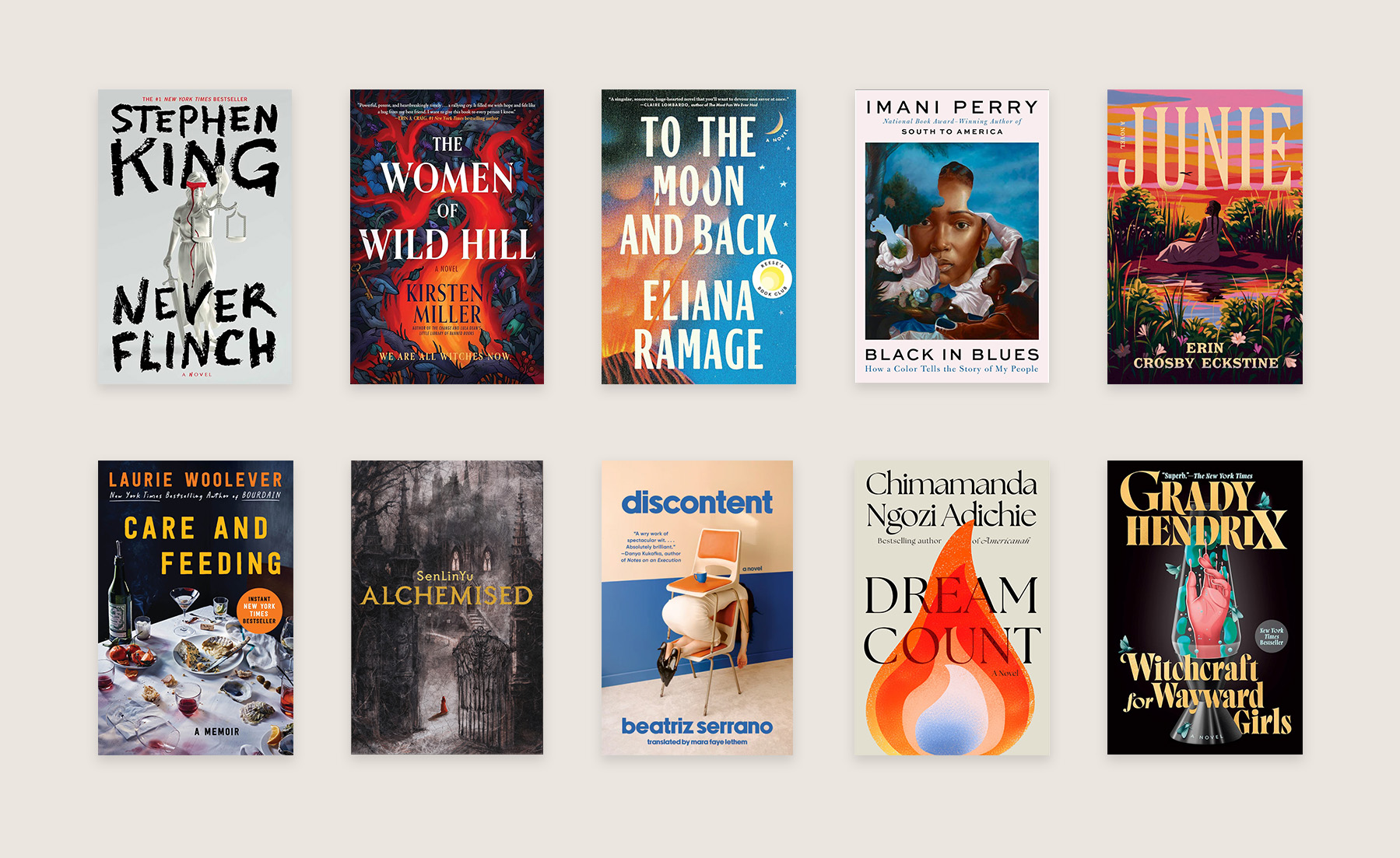
Everyone has bought a book simply because the cover was beautiful (me first!) and as a graphic designer, I understand why certain visual elements capture our attention even before we read the summary.
A beautiful typography, a texture that makes you want to run your hand over it, or a composition that screams "I'm a work of art and I assume it". Because editorial design is more than packaging: it's a statement. Over the past year, publishers and designers have dared to experiment with assertive minimalism, expressive typography and a return to grainy paper. The dialogue between author and reader begins at first sight.
Here are 10 covers that particularly caught my eye as a graphic designer:

1. Care and Feeding
Author(s): Laurie Woolever | Designer: Allison Saltzman | Photographer: Bobby Fisher
Allison Saltzman, in collaboration with photographer Bobby Fisher, gives us a slightly chaotic, yet strangely elegant, after-dinner aesthetic. Gobbled-up oysters, spilled wine, crumbs everywhere... it's messy, but intriguing. You almost want to sit down and listen to what happened that night. The cover doesn't try to be pretty, it's real and that's what makes it a pleasure to look at.

2. Discontent
Author(s): Beatriz Serrano | Designer: Na Kim
A visual representation of burnout, but made almost aesthetically pleasing. Na Kim was inspired by the "one-minute sculptures" by Erwin Wurm and honestly... wow. The woman folded in half under a chair? That's literally us after a long day. The assumed blue typography contrasts the beige-orange and strikes just enough to say, "Yes this is absurd. And no, I won't apologize."

3. Junie
Author(s): Erin Crosby Eckstine | Designer: Adalis Martinez | Illustration: Sonia Lazo
Sonia Lazo's color palette is an anchor in itself. Pink, orange, the sunset reflected in the water: it's both soft and vibrant. The choice of simple typography allows the illustration to take center stage. The result breathes, yet remains expressive, and is the kind of cover that attracts without forcing.

4. Witchcraft for Wayward Girls
Author(s): Grady Hendrix | Designer: Sydnee Monday | Illustration: Suri Mestha
Sydnee Monday and Suri Mestha clearly decided to have some fun. The lava lamp, transformed into an almost mystical object, creates an interesting mix of nostalgia and discomfort. It's an artistic direction that intrigues enough to make you want to know more.

5. The Women of Wild Hill
Author(s): Kristen Miller | Designer: Sydnee Monday | Illustration: Suri Mestha
Same duo as Witchcraft for Wayward Girls but a completely different atmosphere. The central fire, the dark flowers, the dense composition: everything is charged with intensity and makes a statement. The phrase at the bottom "We are all witches now" acts almost like a mic drop. There's no need to go overboard, we want to read it!

6. Black in Blues
Author(s): Imani Perry | Designer: Allison Saltzman | Artist: Calida Rawles
A complete change of energy. Here, the cover uses a painting by Calida Rawles and becomes almost an exhibition piece. The face emerging from the blue tones is calm, yet powerful. It's the kind of cover that speaks softly, but still makes you want to listen.
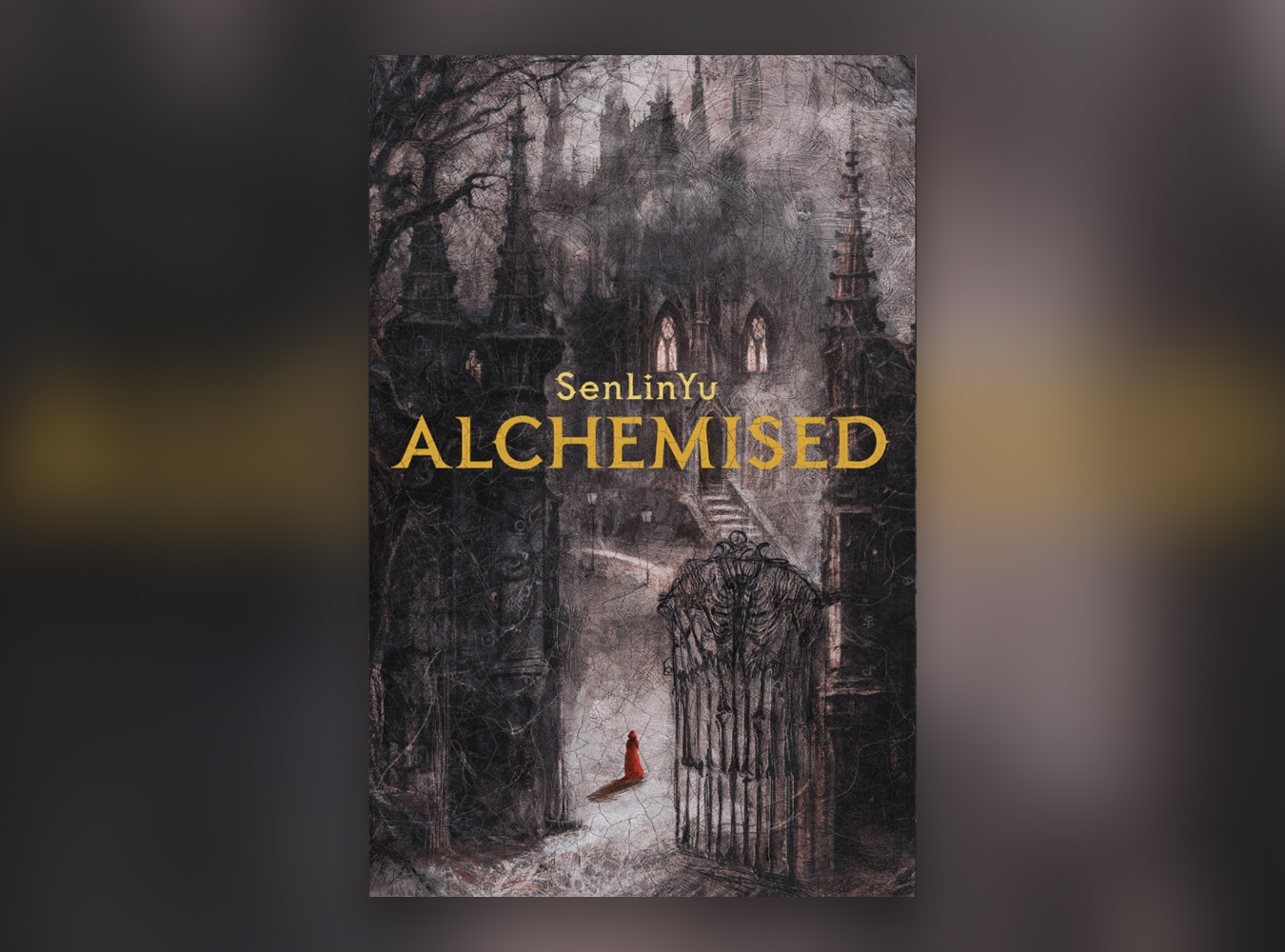
7. Alchemised
Author(s): SenLinYu | Designer: Elithien and Noverantale
Noverantale and Elithien give us an aesthetic dark academia mastered, just the way we like it. A red silhouette in front of an imposing mansion, in a misty, dramatic atmosphere. The crackled texture gives an almost tactile effect, making us want to run our hands over it when we see it in a bookshop.

8. Dream Count
Author(s): Chimamanda Ngozi Adichie | Designer: Peigi Wilson
With this cover, Peigi Wilson has chosen a much more restrained approach. A flame, warm colors, classic typography and nothing superfluous. A cover that knows exactly what it's worth and that, in addition to being visually appealing, makes us want to know what the book is about!

9. To the Moon and Back
Author(s): Eliana Ramage | Designer: Sydnee Monday | Illustration: Suri Mestha
A beautiful balance between warm and cold, between blue and orange. The grain gives a printed, almost nostalgic effect, like an old photo preciously kept in a drawer. A soft cover, but very masterful.
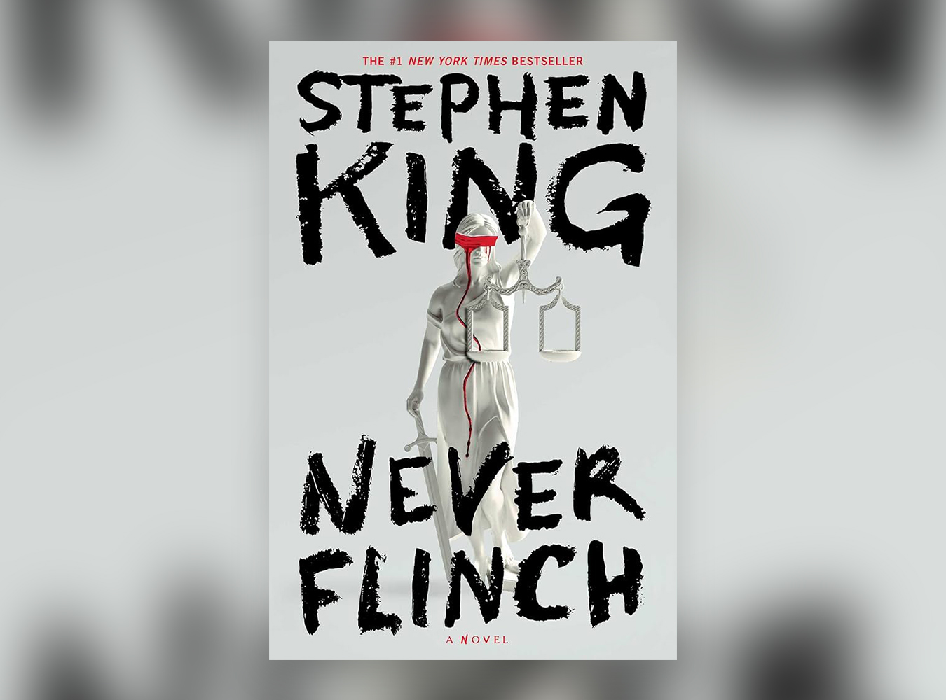
10. Never Flinch
Author(s): Stephen King | Designer: Will Staehle
Will Staehle understands one thing: when you're designing for a literary icon like Stephen King, there's no need to overdo it. A bleeding statue of Justice on a gray background with contrasting, textured typography is cold and disturbing, but above all, it's very effective.
A clear trend in editorial design
What emerges from these covers is a clear desire to assume a direction. Whether minimalist or busy, they all share a strong intention and an assertive visual identity. In design, as in branding, it's often the most assertive proposals that make the most impact. And obviously, editorial design is no exception.
